Job Operation Display
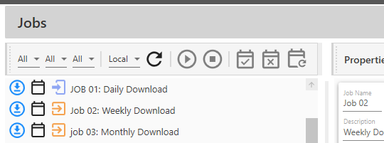
As may be already apparent from recent screenshots, the Jobs Listing filter and button display bar can change display, depending on the number and size of selected items. For example, with nothing selected, everything fits well and appears neatly in the accustomed place.

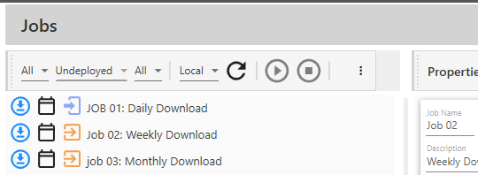
However, when a filter selection is made it can push everything over to the right, possibly causing one or more buttons to 'disappear'.

When this occurs, there are several options open to the user.
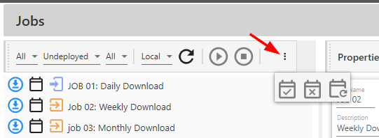
First, they can simply click on the ![]() control to bring up the 'missing buttons.'
control to bring up the 'missing buttons.'

Once these buttons are visible, they can be selected the same as if they were in their usual place.
Another option is to click and drag the column divider to the right to make the jobs listing column bigger.

There is no right or wrong here. It is simply a matter of using whatever method works best for you, the user.